Atmos
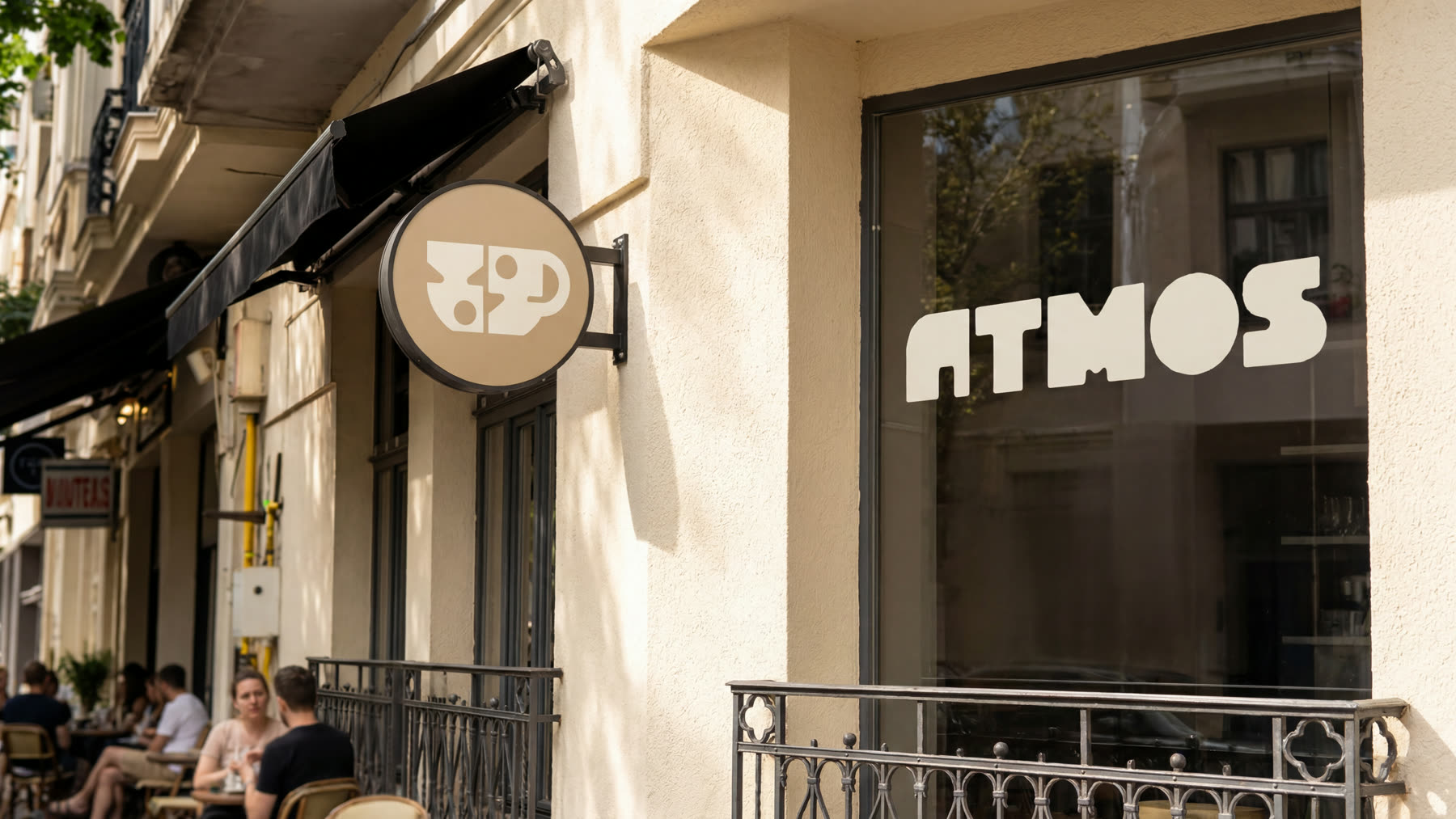
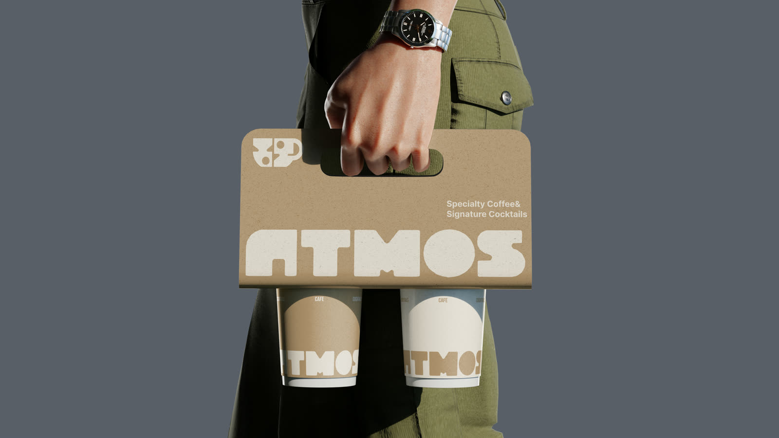
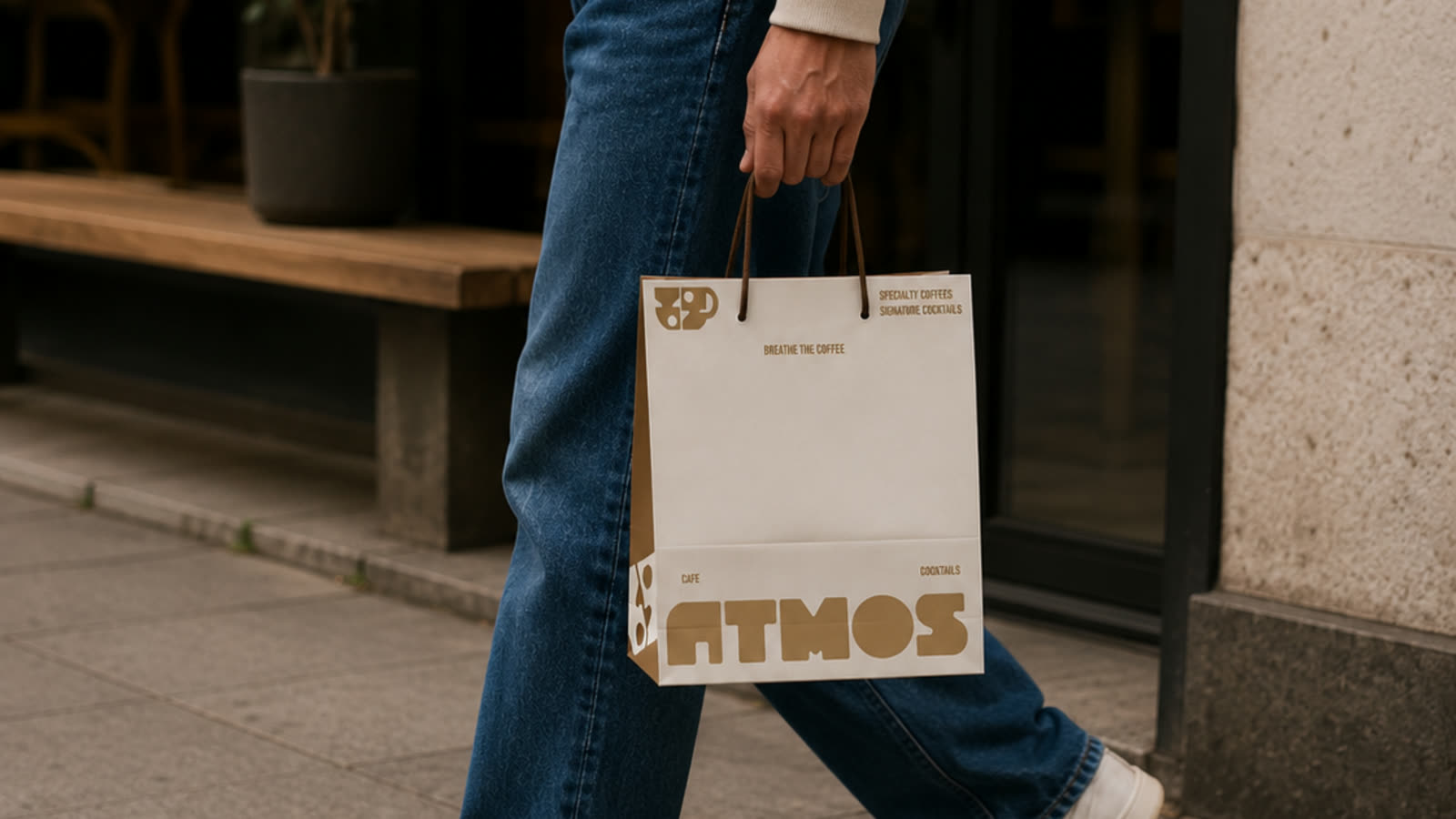
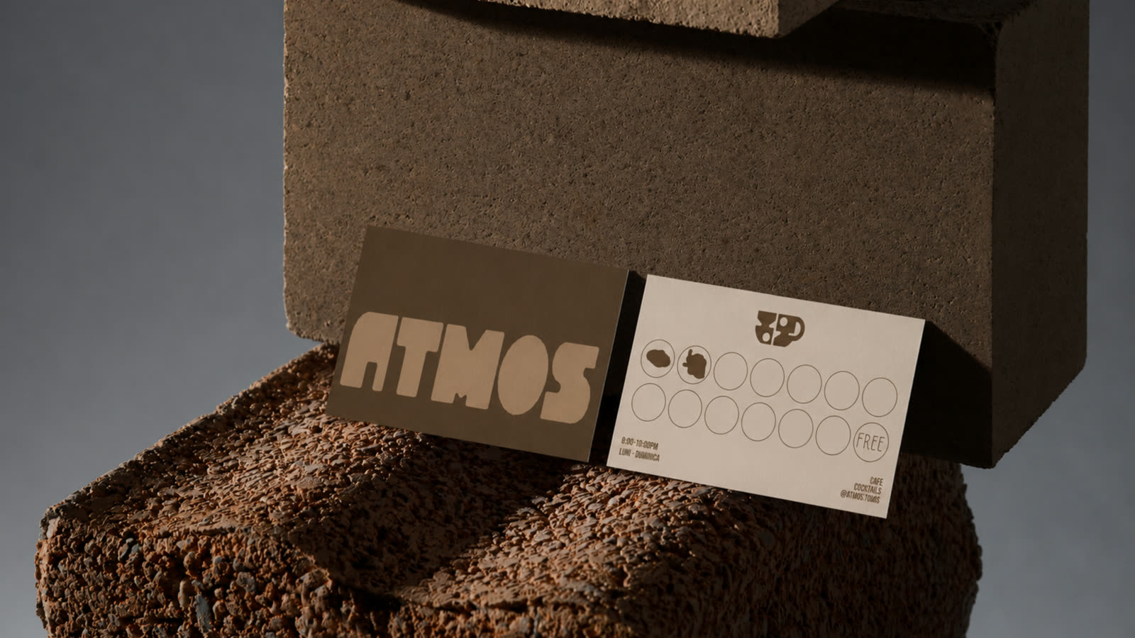
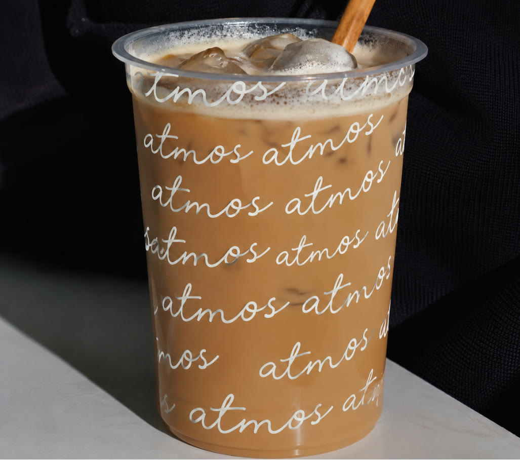
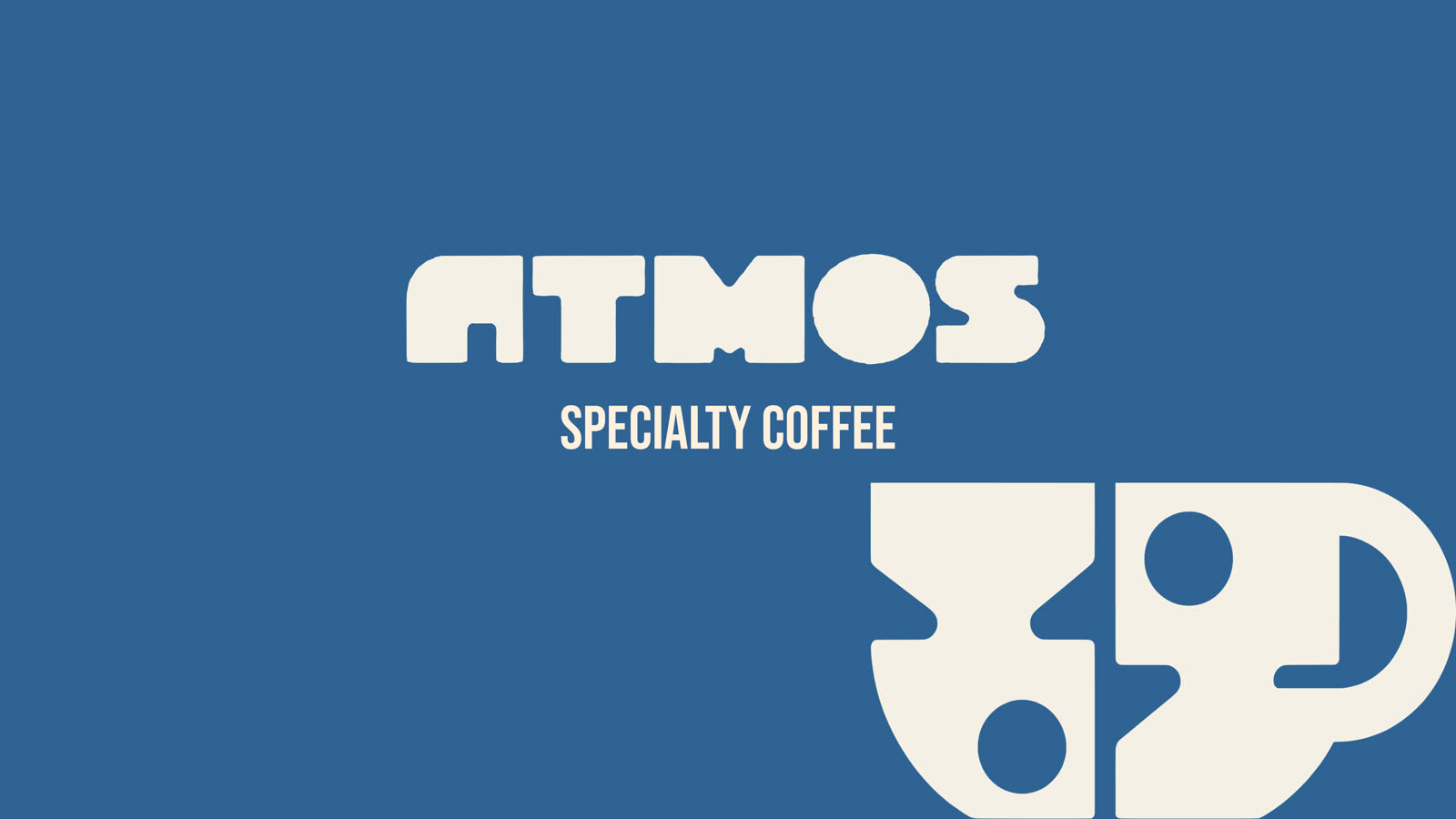
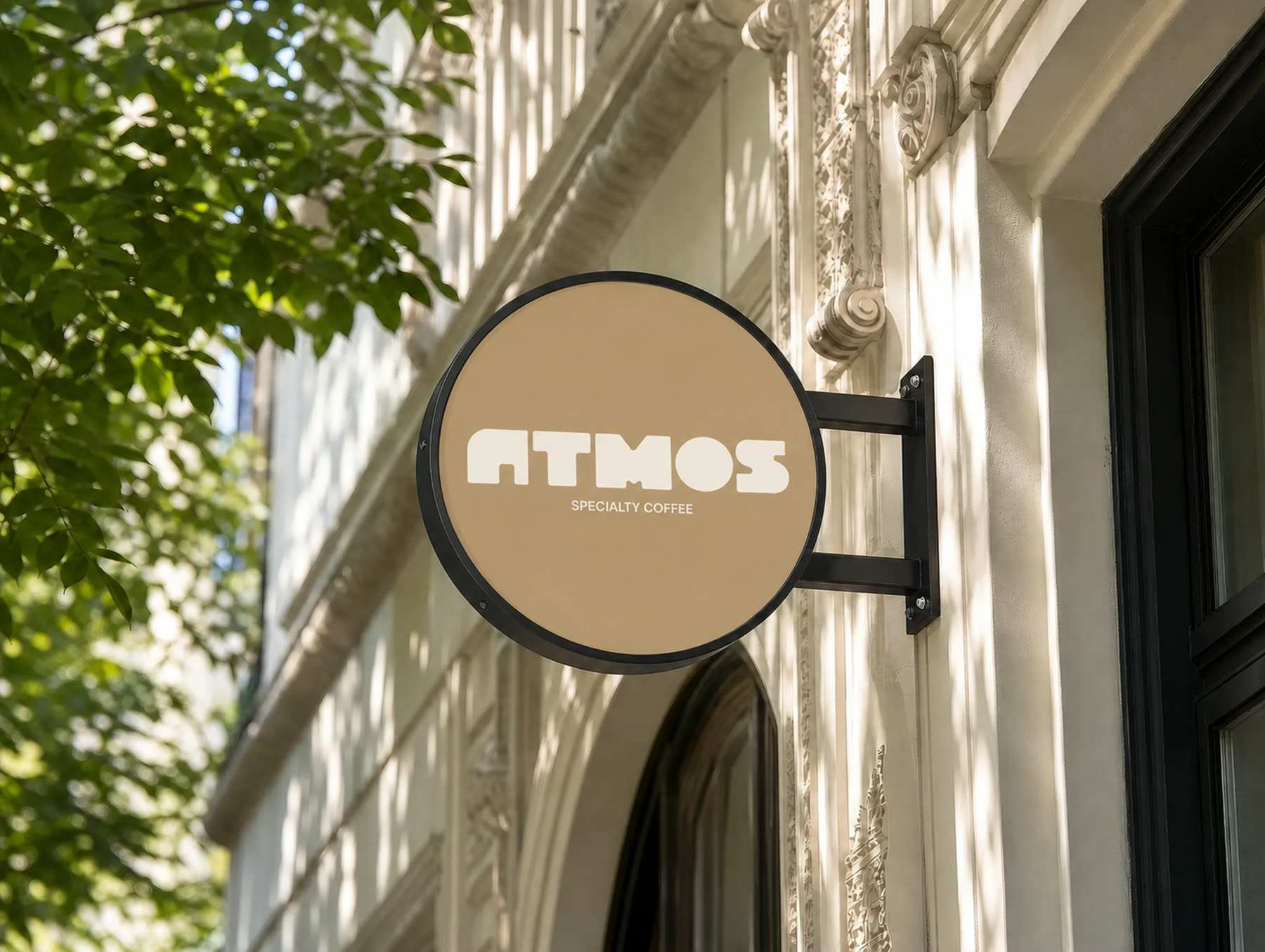
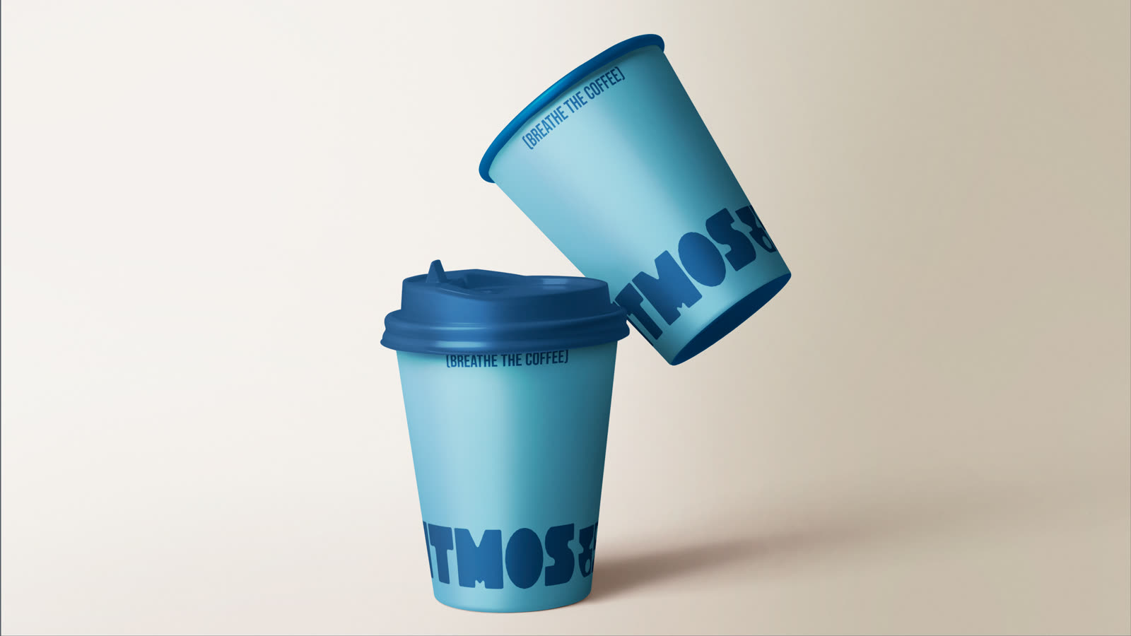
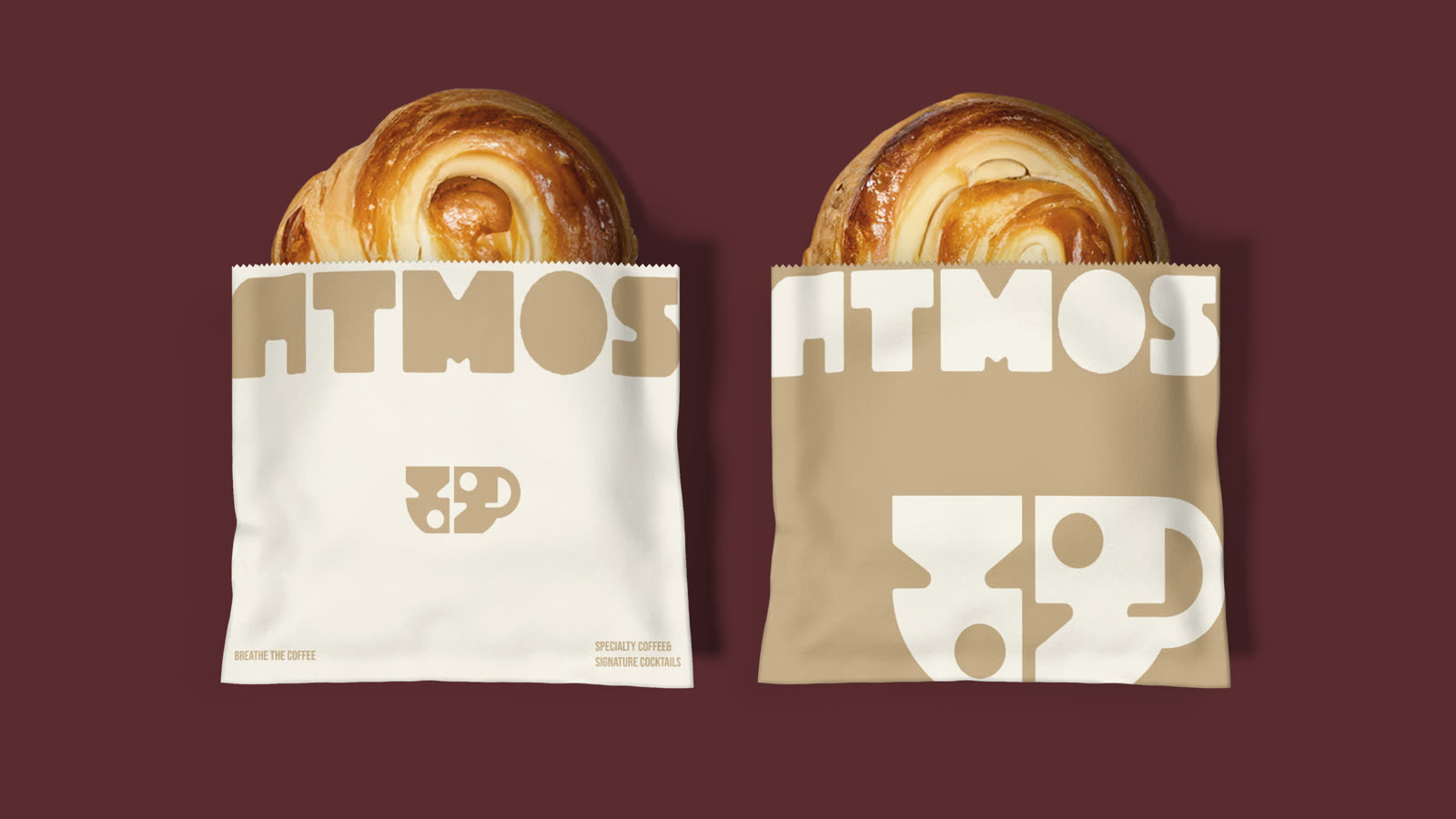
W’10Atmos comes from "atmosphere", a specialty coffee shop we built the full brand for: logo, packaging, merch and signage. Everything breathes the same warm air, cream and brown, like a good cup.
Context
Atmos is a new specialty coffee shop: the name comes from "atmosphere".
The problem
Specialty coffee often looks the same: minimal, cold, interchangeable. Atmos needed memorable warmth.
What we did
A complete brand: logo, packaging, signage, merch.
The system we built
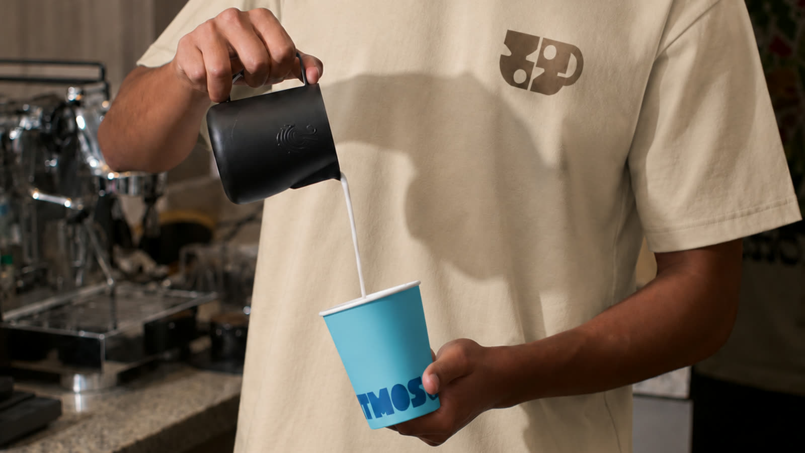
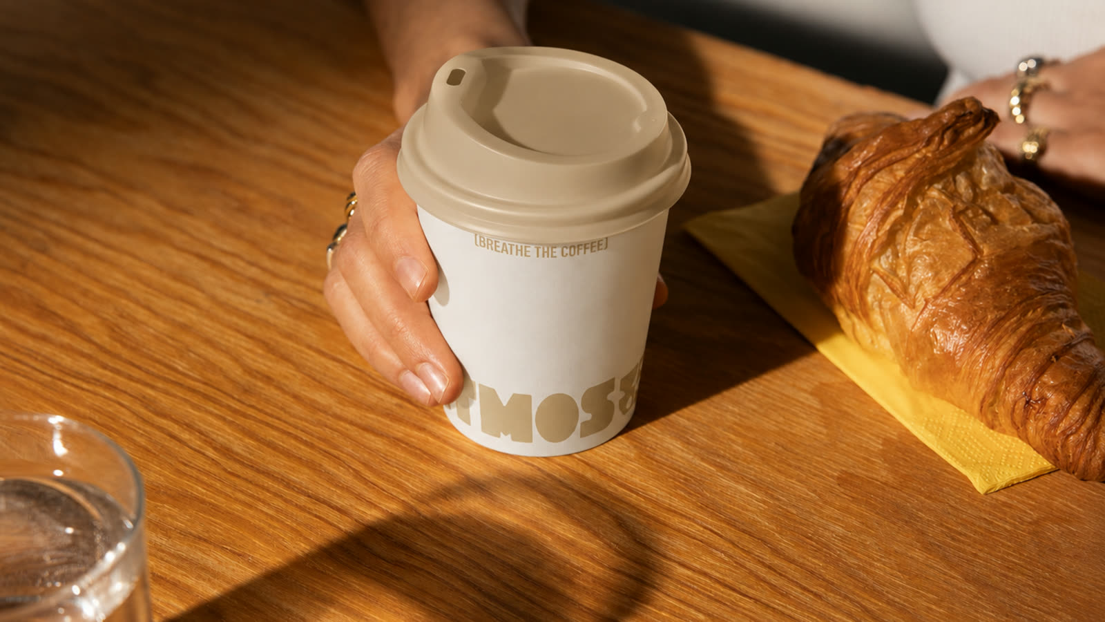
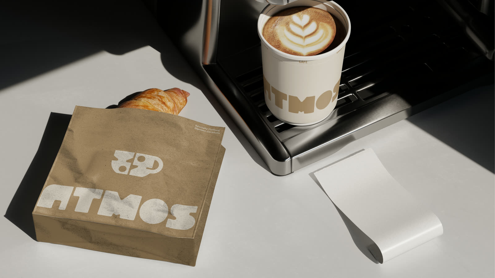
A wordmark round and heavy like freshly ground beans, a cup icon built from abstract shapes, cream and brown on everything you touch: cups, bags, t-shirts, the sign.
The result
We breathe coffee: an identity you recognise from across the street and remember after the first coffee.
The brand promise is simple: we breathe coffee. A wordmark round and heavy like freshly ground beans, a cup icon built from abstract shapes, and a cream and brown palette that smells of espresso.
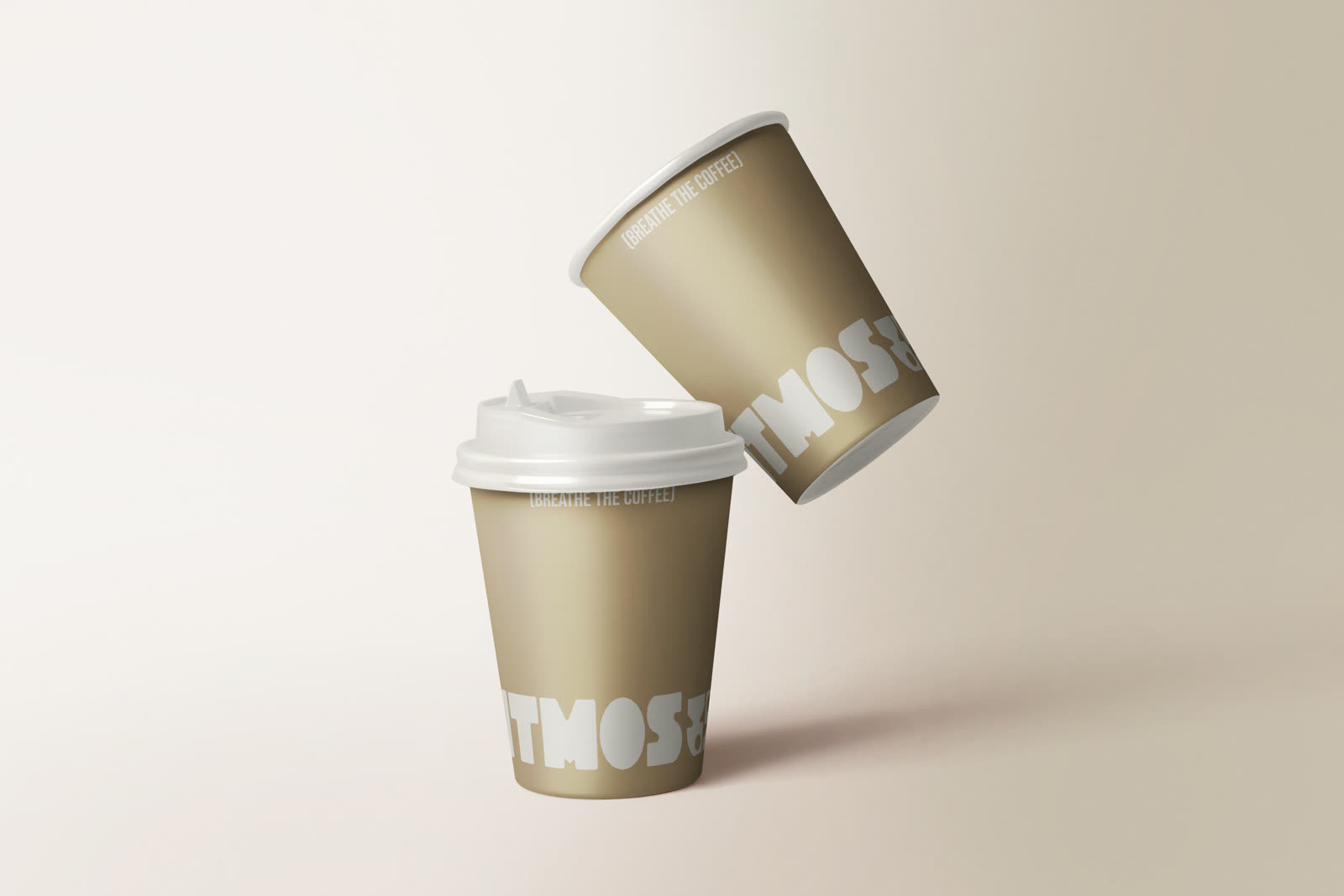
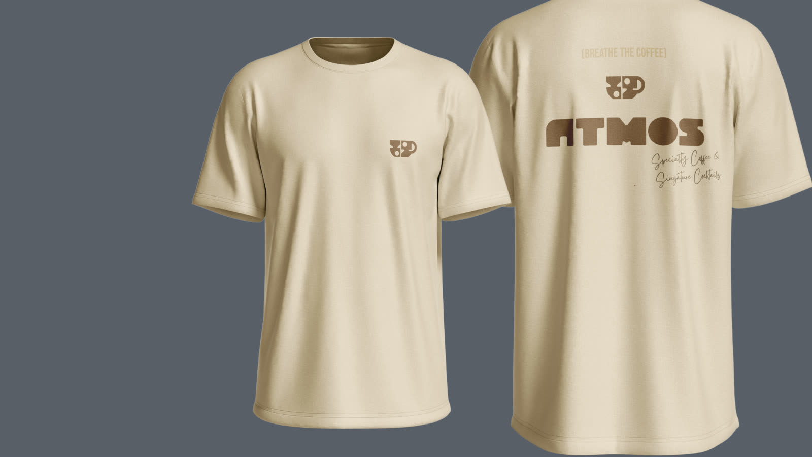
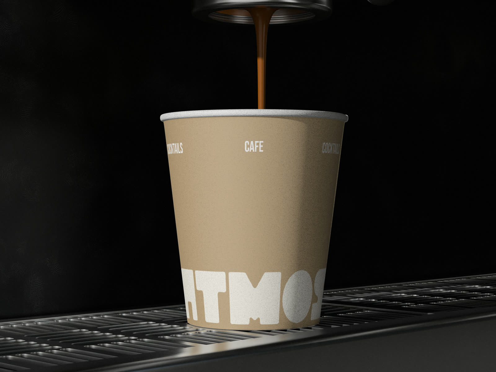
We breathe coffee.
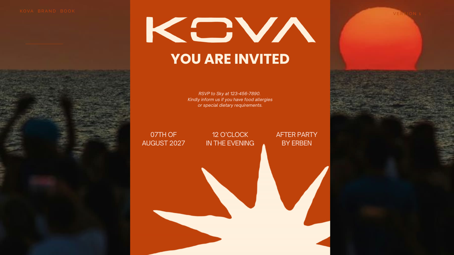
Kova . Event Branding
Kova is an after party, a music event by the sea, for which we built the complete identity: the sun-star logo, posters, invitations, VIP wristbands, glassware and signage.
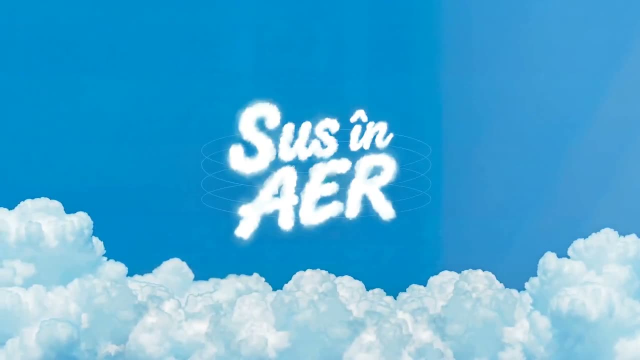
Sus în AER . Event Branding / Illustration
"Sus în AER" is Crama Rasova's event series: hot air balloons, DJ sets and sunsets over the vineyard. We built the identity and the poster series: illustration, typography and animation.
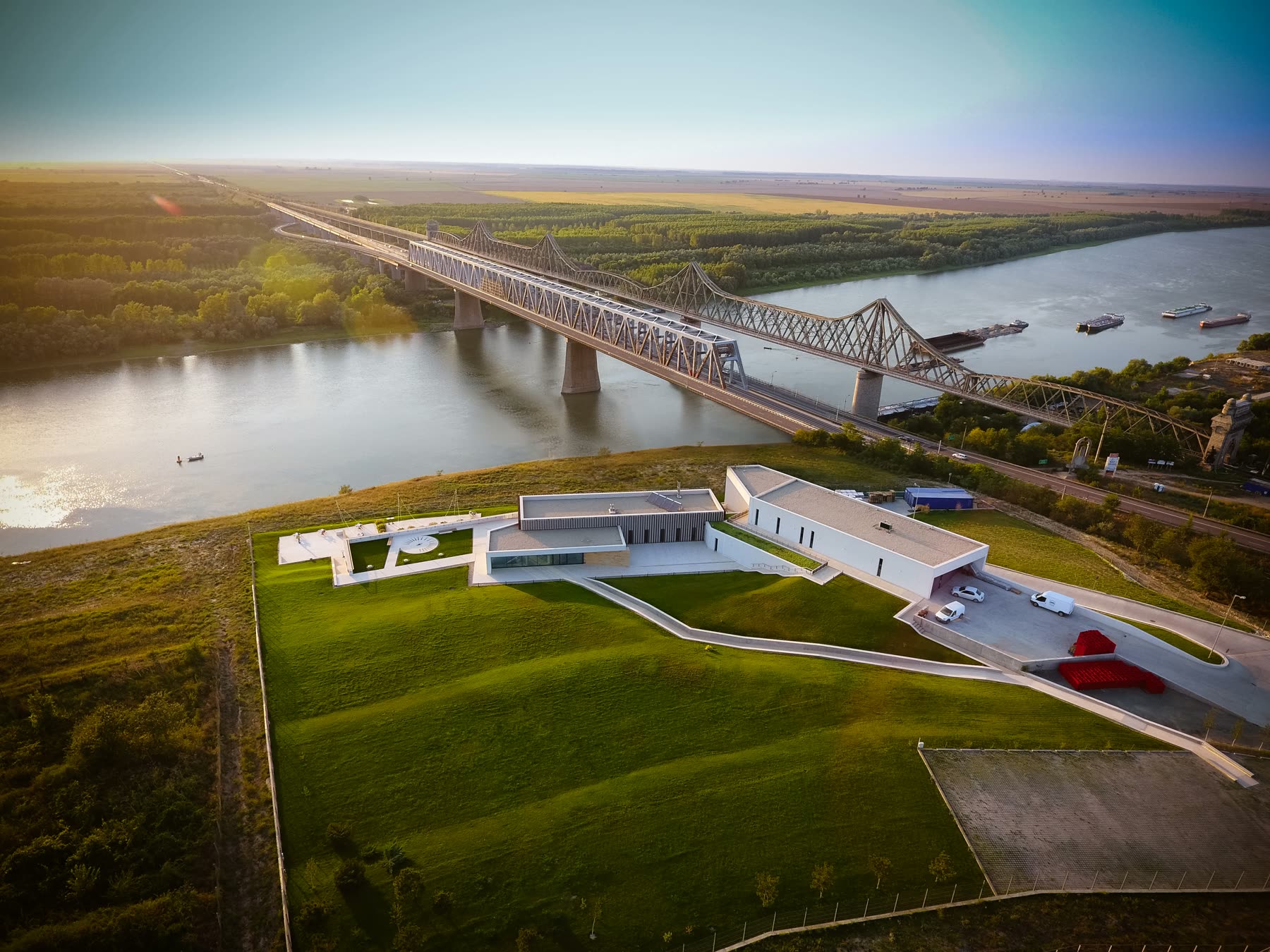
Crama Rasova . Brand & Design / Development
A winery on the Danube, with a site we built end to end: presentation, online store, photography and animation for the La Plage and D’Italia labels.