GO Labs
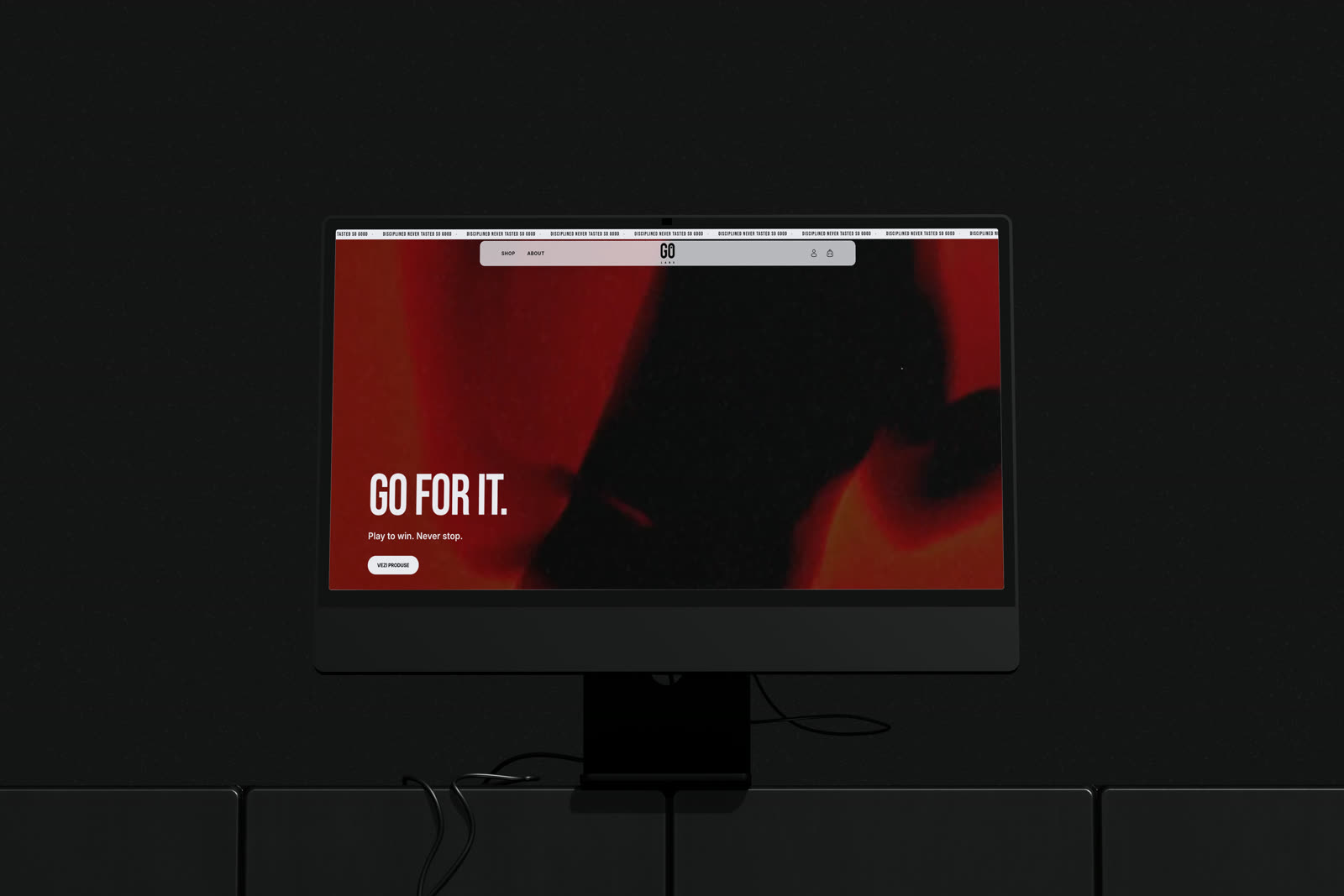
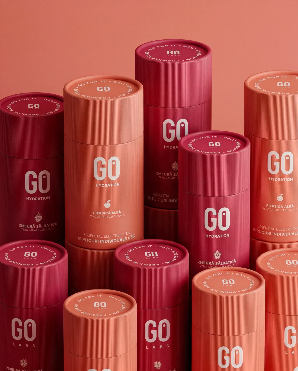
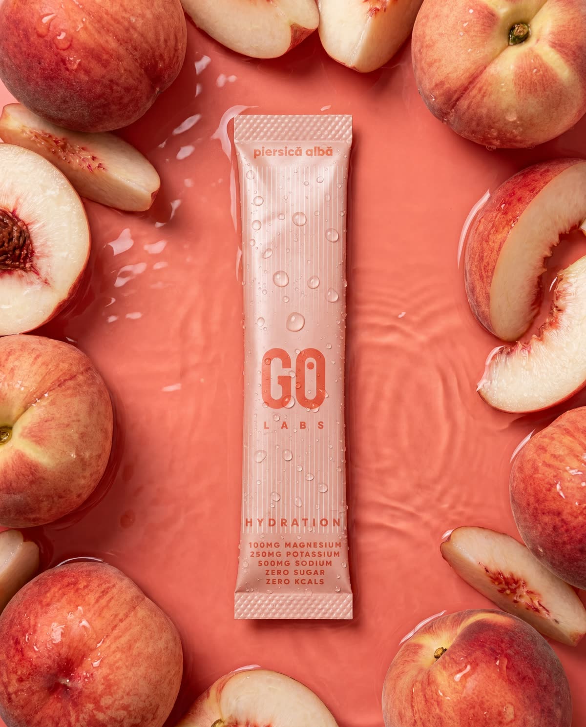
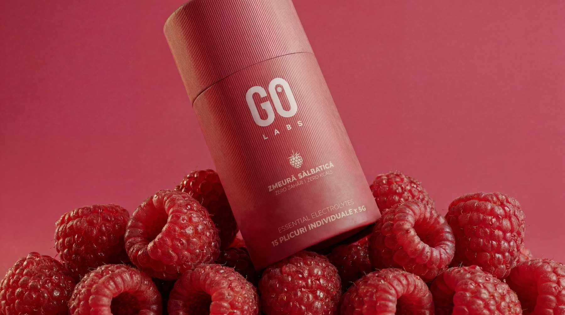
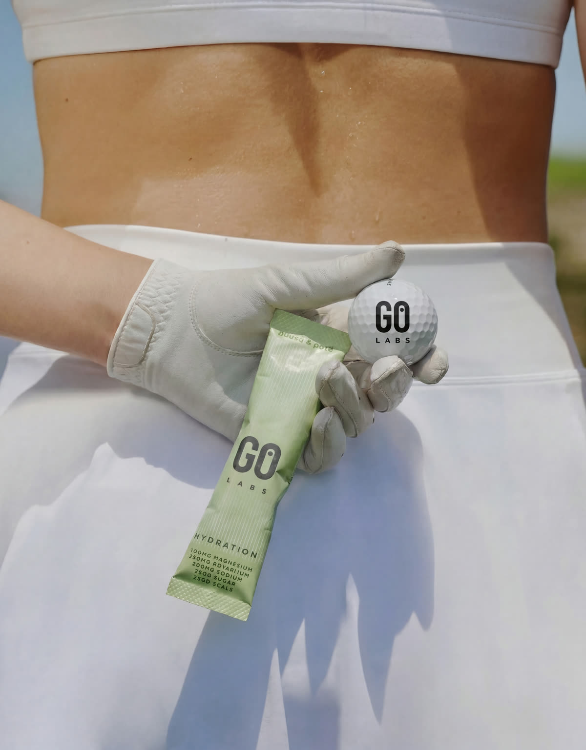
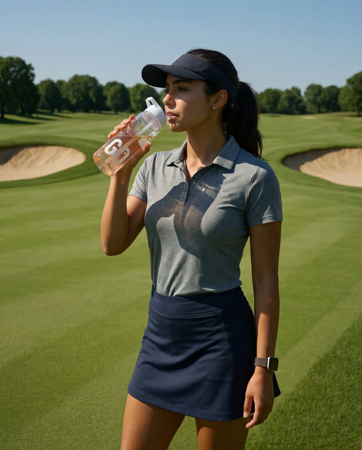
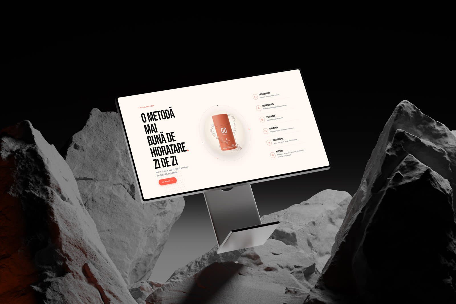
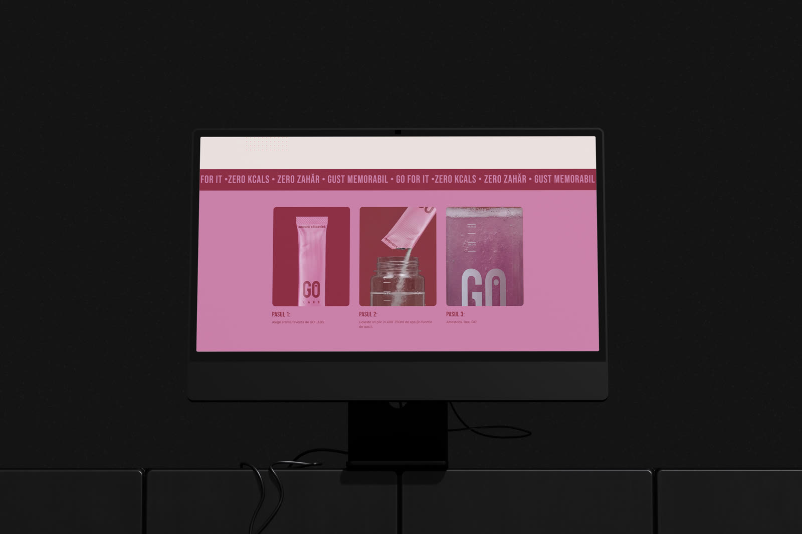
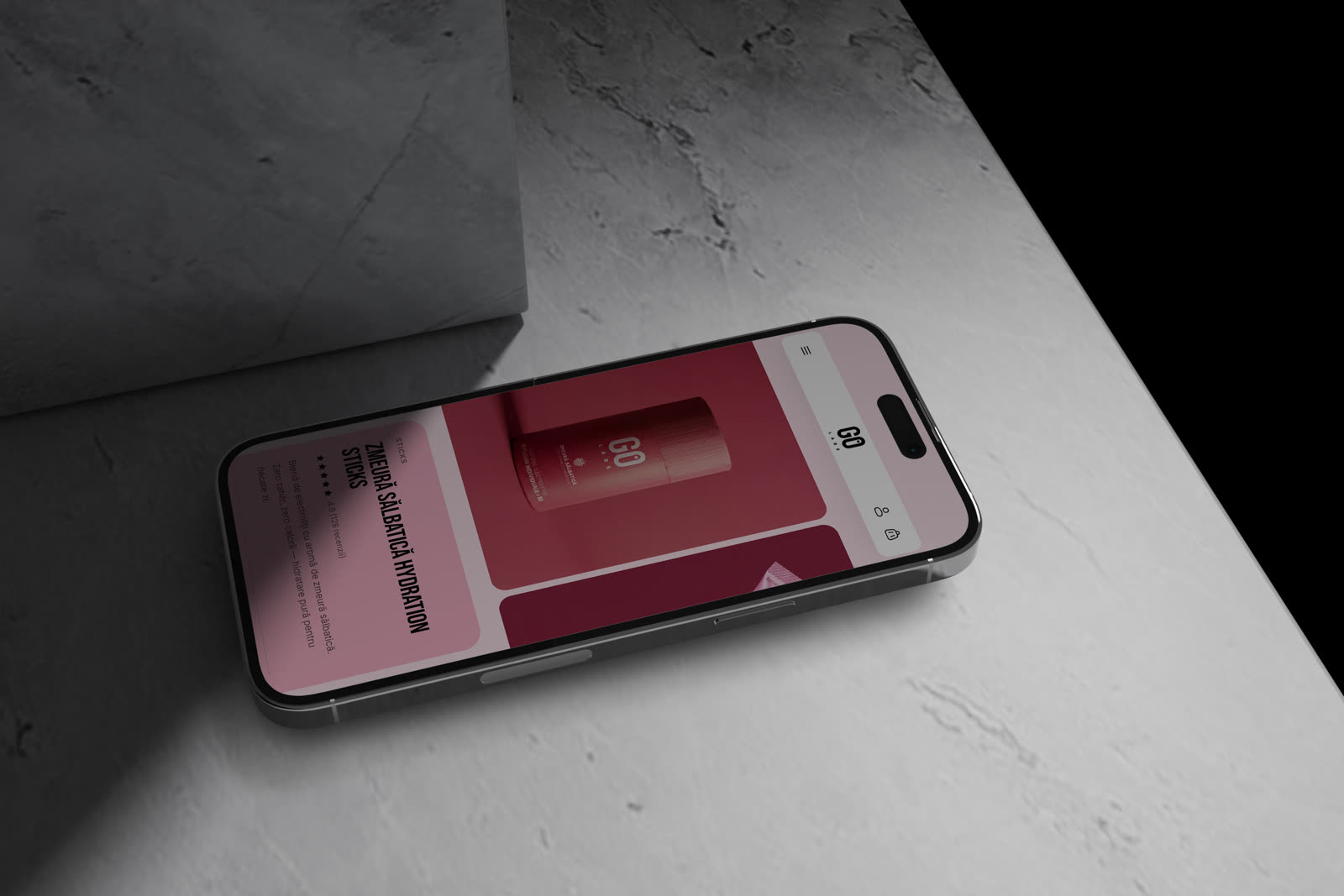
W’04GO Labs is a direct-to-consumer hydration brand: electrolytes in sachets and tubes, in flavours like wild raspberry and white peach. We built everything: the identity, the packaging, the photography, the films and the online store.
Context
GO Labs makes electrolyte hydration, zero sugar and zero calories, for people who move a lot.
The problem
The category is full of sports brands that shout. GO needed energy without aggression. And a store that sells simply.
What we did
Brand and identity, packaging, product photography and video, online store.
The system we built
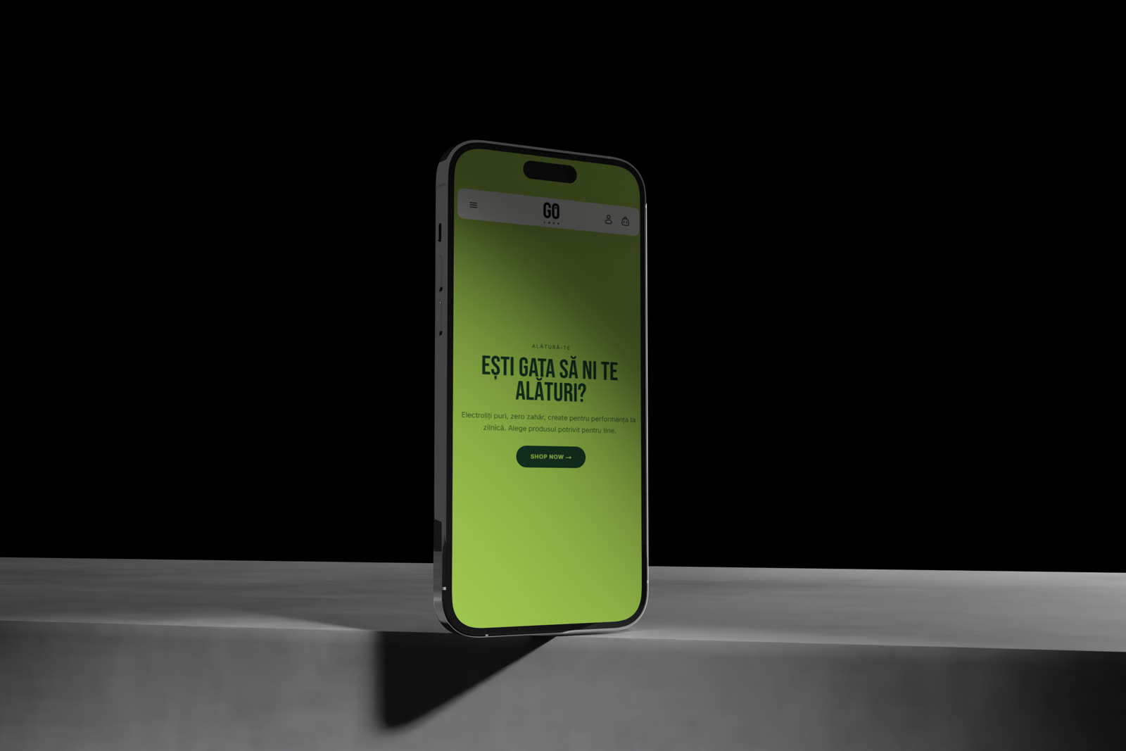
A GO monogram readable at a run, fruit colours across tubes and sachets, one unified photo and video campaign, and a fast shop.
The result
A direct-to-consumer brand coherent from the sachet to the checkout, with a content library ready for campaigns. Go for it.
"Go for it." A GO monogram you can read at a run, colours taken straight from fruit: coral, raspberry, peach. And an online store that moves as fast as the people it is made for.
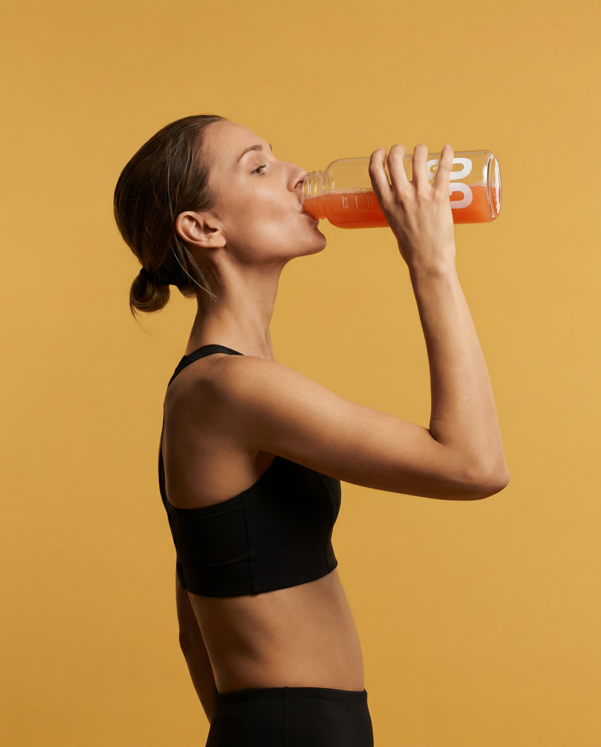
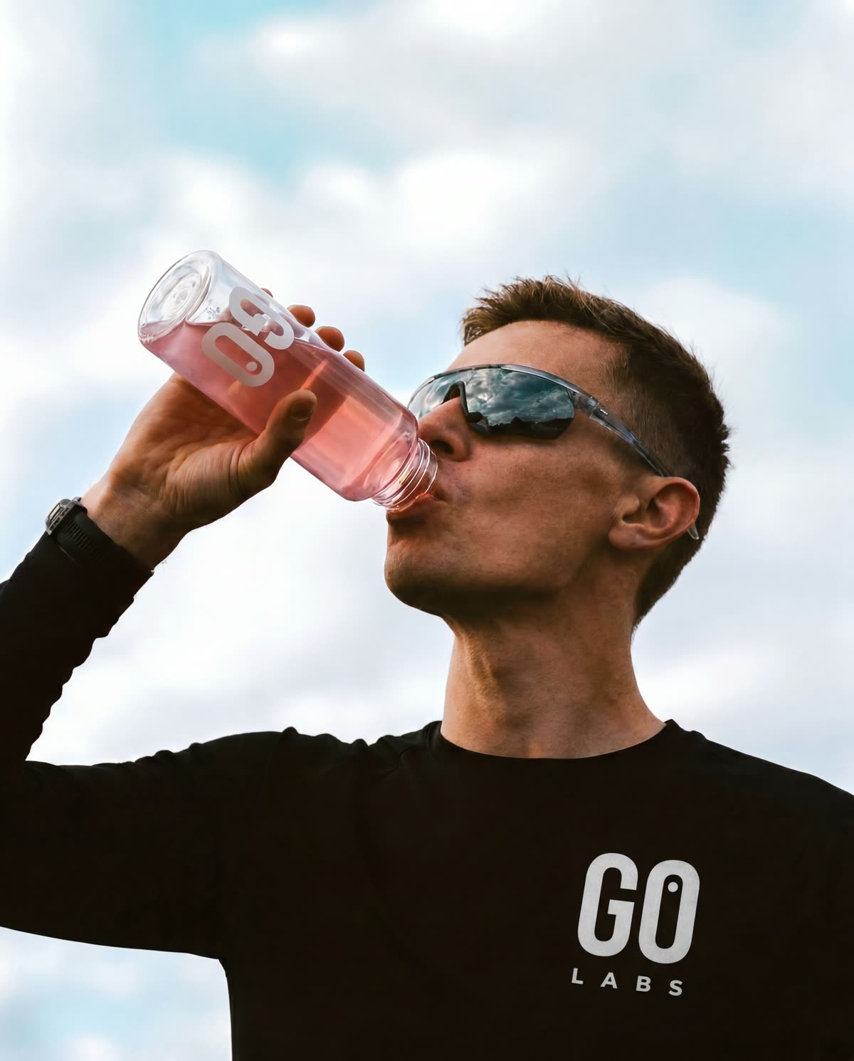
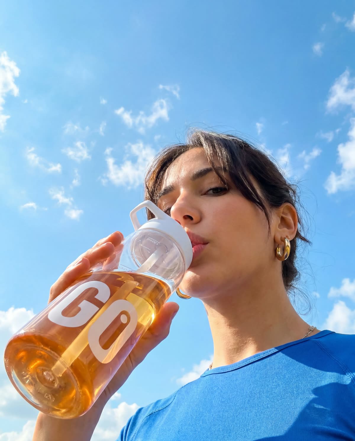
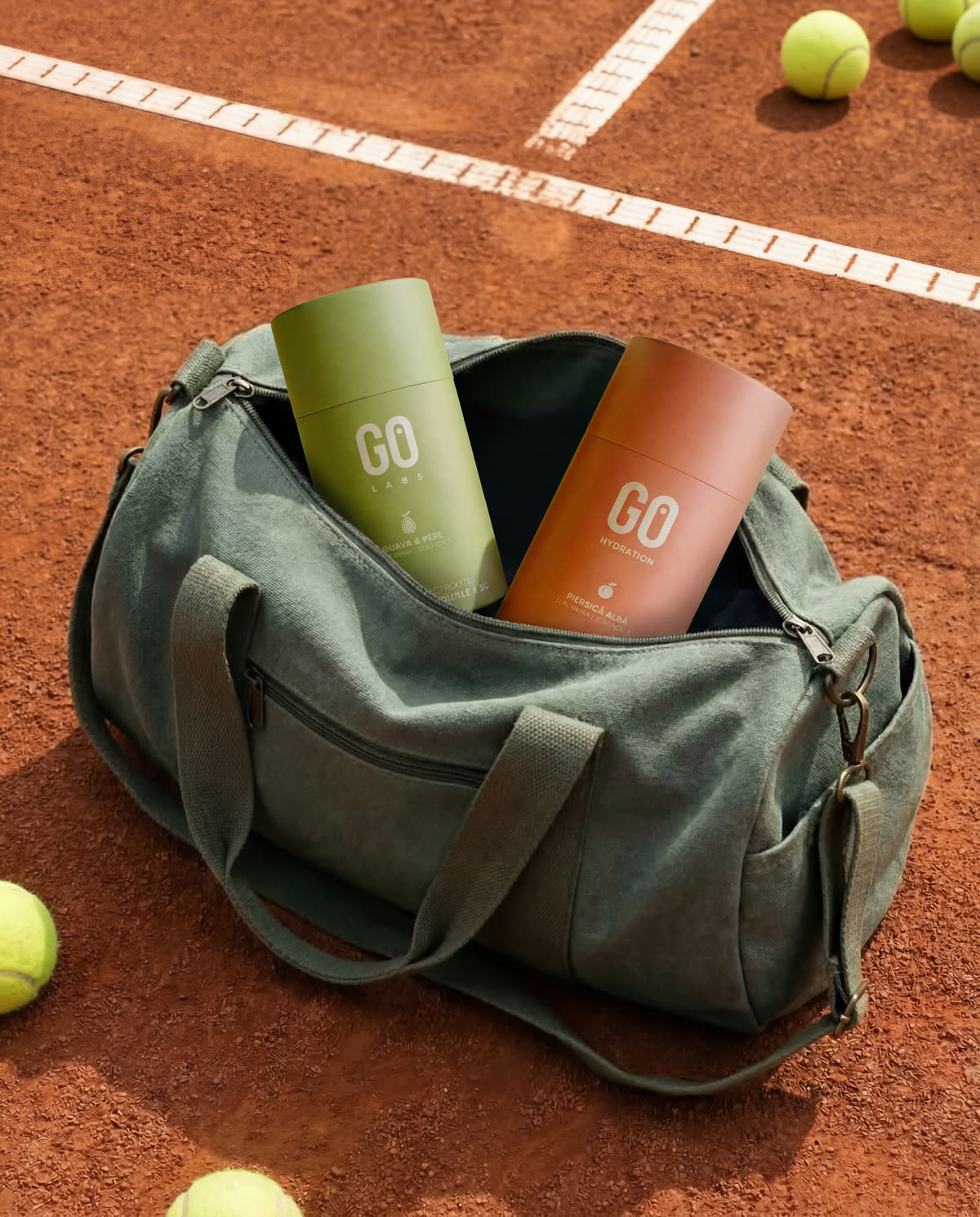

Go for it.
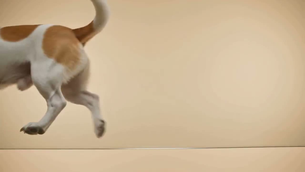
EuroDogs DGM . Design / Development
Design and development for EuroDogs DGM: a clear site, built for trust.

Black Sea Horses . Brand & Design / Video
An equestrian club near Constanța. Together we built the visual identity, the site and a series of brand films: a warm, editorial world around a single idea: come for the riding, stay for the feeling.
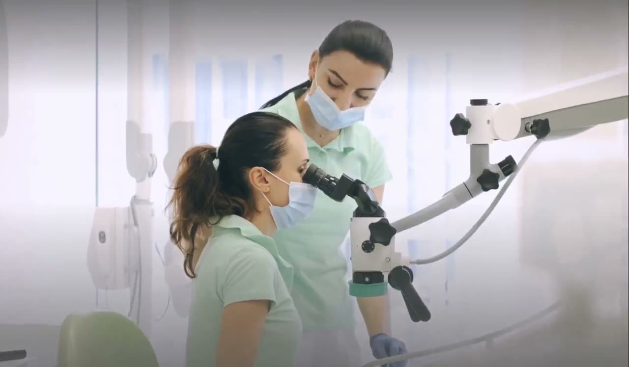
Clinica Man . Design / Development
Design and development for Clinica Man: a medical site that is clear, calm and easy to use.